I have always been a huge fan of hand-lettering and custom typefaces, marveling at the magical and flexible nature of letterforms. Occasionally, I’ve had the chance to try my hand at this amazing form of art. While I may not be as skilled as I’d like to be, I can see myself making progress with each attempt. Each piece I create represents a glimpse of my creativity and dedication to this captivating art form. While I know there’s room for improvement, I take pride in the progress I’ve made and the unique touch I bring to each creation.
I hope that by sharing my word-marks and letterforms, I can inspire others to explore the world of hand-lettering and custom typefaces. It’s a rewarding realm of art that allows for endless possibilities and personal expression. With practice and patience, one can witness their own unique style emerge and make an impact. I believe that the joy of creating something original with my own hands and seeing the letters come to life is an experience worth sharing.
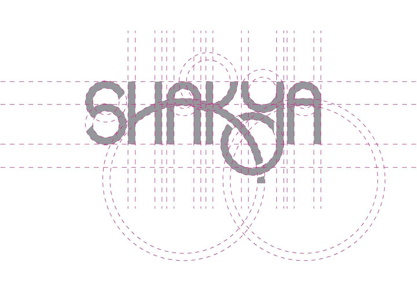
Grid System
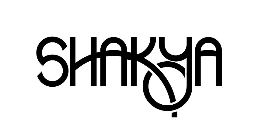
One of my early wordmark experiments was with my daughter’s name. I’m thrilled to share the final presentation of this project, which you can see in the first image above. To create this wordmark, I utilized a grid as shown in the second image. This particular wordmark was a significant part of my 30-Days logo challenge submission back in 2020.
Working on my daughter’s name allowed me to infuse a personal touch into the design. It was a heartfelt project that motivated me to explore various lettering styles and compositions. I wanted the wordmark to reflect her unique personality and spirit, making it a truly special and meaningful endeavor for me.
To ensure precision and balance in the design, I used the grid showcased in the second image. The grid provided a solid foundation, allowing me to carefully craft each letter and maintain consistent proportions throughout the wordmark. It was an essential tool in achieving a cohesive and aesthetically pleasing result.
The entire experience of creating this wordmark was enriching and inspiring. It encouraged me to continue my journey in hand-lettering and custom typefaces, pushing my boundaries and seeking new creative challenges. Being part of the 30-Days logo challenge further fueled my passion for design and motivated me to embark on more ambitious projects.
Ambigram
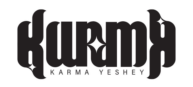
Creating ambigrams is undoubtedly one of the most challenging forms of art. The wordmark I designed originally served as my personal logo, and its remarkable feature is its ability to be rotated upside down while still spelling out the word “Karma.” This design uniquely reflects my upbeat personality, which remains resilient and unwavering, regardless of life’s obstacles.
The rotation of the ambigram also carries a profound symbolism, representing the true meaning of “Karma” in my language – the well-known cause-and-effect cycle, where what goes around comes around. This concept aligns with my beliefs and values, adding a deeper layer of meaning to the wordmark. The word also holds another significant interpretation in my language, symbolizing a “star.” To honor this dual meaning, I thoughtfully incorporated three stars into the wordmark, adding a touch of personal identity and cultural significance to the design.
Letter Combination
The gray logo cleverly combines the letters K and S, while also drawing inspiration from the symbol of the eternal knot in my culture. It represents a harmonious fusion of these elements, creating a visually appealing and culturally significant design.
On the other hand, the magenta logo portrays a shopping cart, ingeniously crafted from the letter combination T and W. This particular design was specially created for one of the mini marts, offering a distinct and memorable representation for the business.
Both logos showcase my creativity and ability to incorporate meaningful elements into my designs. They serve as powerful examples of how art and culture can intersect, resulting in visually striking and purposeful logos that leave a lasting impression.
Onomatopoeia
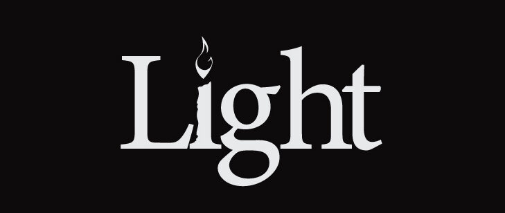
In 2020, I submitted this particular design for the 30 days logo challenge. The wordmark features a candle symbolizing light amidst darkness, and the carefully chosen color palette complements the concept.
In this project, I explored the fascinating world of onomatopoeia, where the visual form of the word directly reflects the sound it represents. The wordmark effectively captures the essence of a candle’s soft flickering glow, symbolizing hope and illumination during challenging times.
Through this entry, I aimed to showcase not only my design skills but also my ability to convey meaning and emotion through visuals. The wordmark stands as a testament to the power of symbolism and how it can effectively communicate complex ideas with simplicity and elegance.
Dzongkha
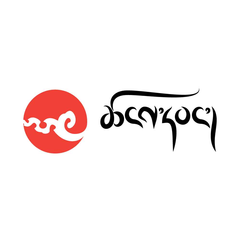
Creating this hand-lettering piece with Bhutanese script was an exciting and challenging endeavor for me. In my culture, free-flowing calligraphies are not as common, making this project a unique exploration of artistic expression. While Tibetan calligraphy serves as a point of reference, the characters deviate significantly from the base script, making it incomprehensible to Bhutanese readers.
In this hand-lettering, I aimed to break the rigidity of the characters and introduce an organic flow while staying true to the base script “Uchen.” Preserving the essence of the original script was essential to maintain the cultural significance and readability of the wordmark. Balancing the artistic freedom with the cultural authenticity posed a fascinating creative challenge.
The wordmark above reads “Tshang-Wang” in Bhutanese script. Through this hand-lettering piece, I sought to bring a fresh perspective to the traditional script, infusing it with a sense of fluidity and creativity.
As I continue on my artistic journey, I look forward to creating even more captivating word-marks and letterforms. Learning from other talented designers and pushing my boundaries will help me refine my skills and bring forth even more magical and expressive designs in the future. I am excited to challenge myself and embrace the process of continuous growth.
