Despite my limited drawing skills, I have learned a valuable technique in graphic design known as Graphic Translation. This method allows me to recreate images, even without intricate artistic abilities. I have come to appreciate that it is one of the most useful tools in the field of graphic design, enabling me to craft logos, posters, and captivating backgrounds.
The process of Graphic Translation may involve various approaches, but here is my preferred method.
SELECT AN IMAGE
To explore the fascinating world of image transformation, let’s pick a photograph. Open the chosen image on Adobe Photoshop to begin our creative journey.
GRAYSCALE
We’ll convert the image to black and white to lay the foundation for the posterization process. Go to “Image” in the menu, then select “Mode,” and finally, “Grayscale.” This will strip the image of its colors, preparing it for the upcoming adjustments.
POSTERIZE
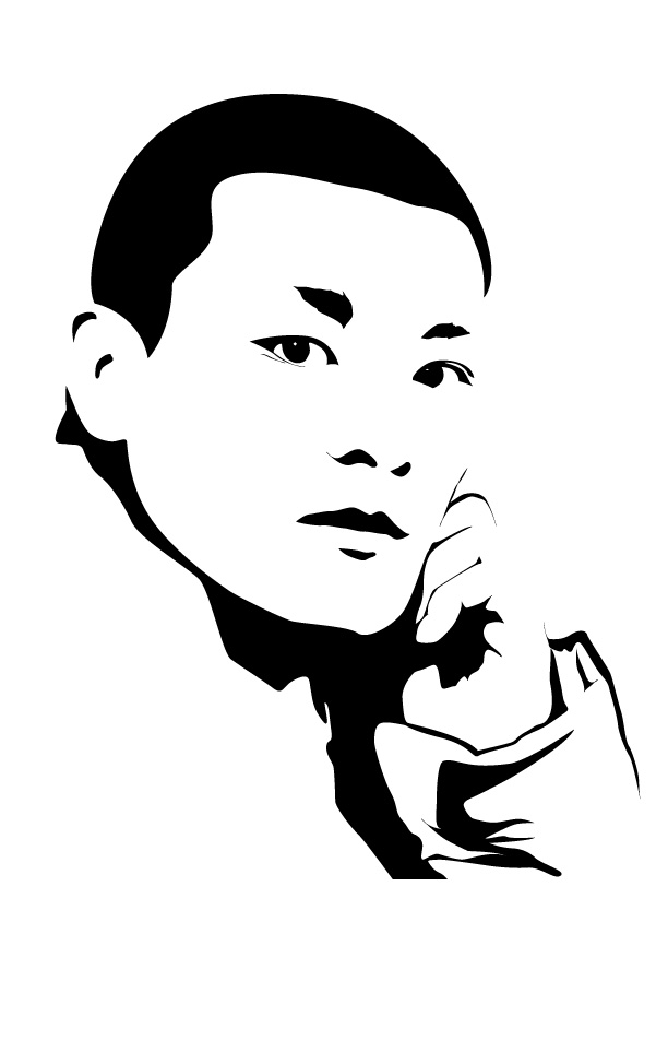
Once the image is in grayscale, we can start the posterization process. On the layer panel at the bottom, right-click on “Fill & Adjustment,” and a dropdown menu will appear. Look for the “Posterize” option.
EDIT VALUE
Now comes the artistic experimentation. Adjust the posterization level to your liking. A range between 3 and 7 is a good starting point, but feel free to explore different values based on your artistic vision. Keep in mind that the optimal value may vary depending on the image’s complexity and content.
Previous
Next
REFERENCE
Save a JPG for each posterization value you experiment with. This way, you’ll have various versions of the image, each with its unique visual appeal. These posterized images serve as valuable references for the upcoming tracing process.
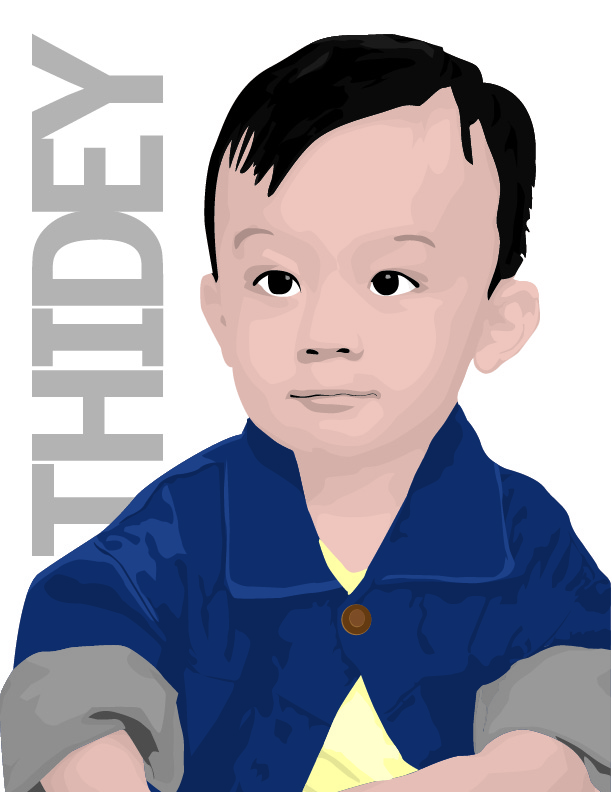
Now, it’s time to switch gears to Adobe Illustrator. Open a new project and import your preferred posterized reference image. Using the pen tool in Illustrator, carefully trace the contours of the image. As you progress with the tracing process, remember that it’s entirely okay to add your creative touch. Feel free to make subtle adjustments or enhancements to make the artwork uniquely yours.
Once you’ve successfully traced the image in grayscale, it’s time to add color to bring the artwork to life. Experiment with different color palettes and tones, ensuring they complement the composition and create the desired visual impact. Play around with shadows, highlights, and textures to add depth and dimension to the artwork. This is your chance to truly make the image your own and infuse it with your artistic vision.
Even with a notable decrease in details, the subject remains identifiable in this graphic translation, crafted with my limited drawing skills. I believe I’ve done a commendable job in executing this technique, and I’m confident that you can do the same.
Feel free to explore some of my other graphic translation projects, where you’ll witness how I’ve applied this artistic approach in various endeavors.