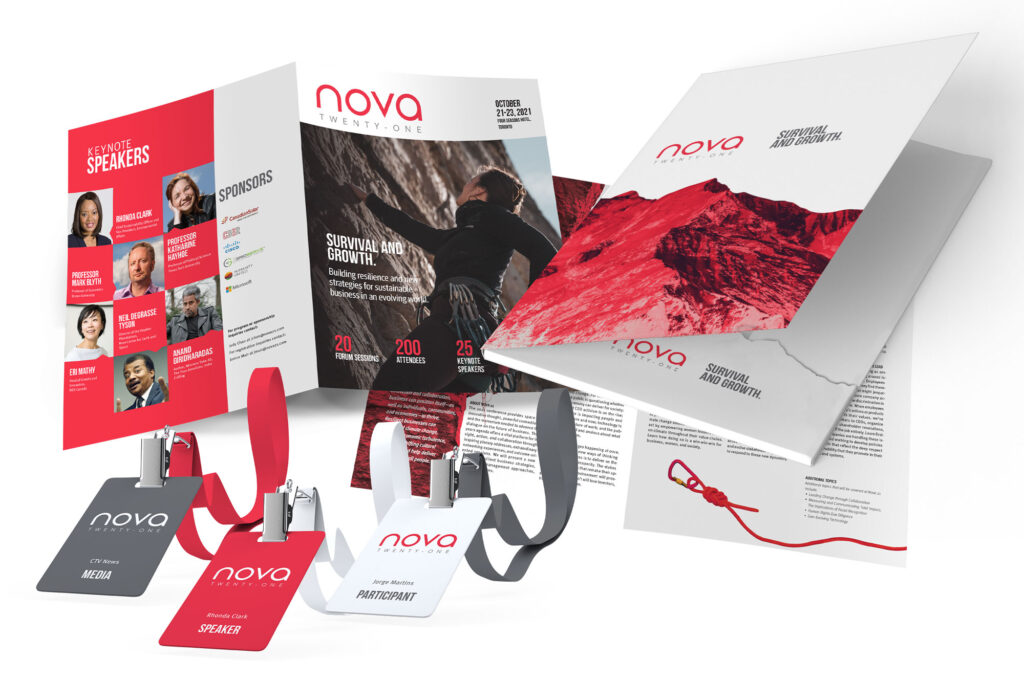
The Nova 2021 conference is a dynamic platform that fosters innovative thinking, fosters powerful connections, and ignites the momentum needed to drive forward the discourse on the future of business.
In the corporate sector, values like simplicity, honesty, and sensitivity are highly regarded, making a clean and modern sans-serif wordmark a fitting choice. The simplicity of the design reflects the core attributes prized in the business world, while the use of a modern sans-serif font adds a contemporary touch to the visual identity.
The color red, known for its associations with excitement and passion, is strategically utilized to draw attention and stand out in a crowded landscape of events. Red’s vibrant energy conveys the conference’s fervor and dedication to pushing boundaries and exploring new frontiers.
Additionally, the mountain imagery serves as a powerful metaphor for the challenges and obstacles that businesses encounter. Just like climbing a mountain, these difficulties may be tough to conquer, but not insurmountable. The visual representation of the mountain symbolizes the resilience and determination of participants to overcome obstacles and strive for success.
By incorporating the color red and the mountain metaphor into the visual identity, the conference creates a distinctive and memorable brand that resonates with attendees. This powerful combination captures the essence of the event’s goals, fostering a lasting impression and fostering engagement among participants who are eager to tackle the challenges ahead.
Event collaterals such as brochures, posters, websites, folders, and cards are essential in building a strong brand identity and effectively spreading the business message of an event. They serve as tangible representations of the event’s brand and purpose, leaving a lasting impression on attendees and potential participants. Through cohesive design and consistent branding elements, these collaterals contribute to creating a sense of trust and professionalism, encouraging engagement with the event and its message.

This websiteprototype can be best viewed on a bigger screen as it was designed to be one.
Disclaimer:
Please note that this project was completed as part of school work and does not reflect any real-life projects or involvement with the mentioned brand(s). The use of brand names in this context is purely for academic and educational purposes and does not imply any actual association or endorsement. This project was a simulated exercise aimed at developing skills and knowledge within the academic setting. Any resemblance to real brands or projects is purely coincidental.


